
Paradisus NYC
Logo Suite · Brand Mark · Branding Graphics
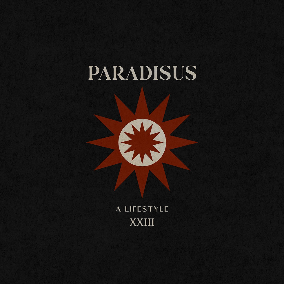
Paradisus NYC is a resort label built in a city with no coastline. Tees, shirts, dresses and pareos made for somewhere else, sold to people who live here. We built the logo suite, the brand mark and the graphics that carry it across the collection.
SITUATION
Paradisus NYC was selling resort wear to a New York customer, which is a harder brief than it sounds. Resort is a category that leans on the destination to do the work, and the destination is not there. The clothes had to hold the feeling on their own, in a city, in February, on a hanger.
DIAGNOSIS
Every resort brand reaches for the same shorthand: a palm, a script, a sunset gradient. It reads as a souvenir rather than as a label, and a souvenir has no reason to exist once the trip ends. What the brand needed was a mark with enough structure to belong in New York and enough warmth to still mean escape.
DECISION
Build the identity for the city and let the collection carry the heat. The mark holds its own on a label, a box and a storefront, and the graphics do the work of place without ever falling back on the postcard version of it.
WHAT WE BUILT
The primary brand mark for Paradisus NYC and a full logo suite around it, with alternates and a mark-only lockup sized for everything from a woven tag to a website header. A set of branding graphics that extend the identity across apparel, packaging and digital, with the rules for how each one is applied. One system that works at the size of a hangtag and at the size of a shopfront.


