
Brand Marks: The Small Symbol That Carries the Weight of an Entire Brand
- Mar 6
- 4 min read
Updated: Mar 31
There’s a moment that happens to founders when they start building a brand.
They open Instagram. They look at other companies. They start noticing the little symbols.
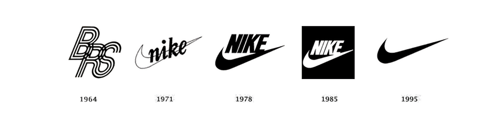
The Nike swoosh. The Apple apple. The Target bullseye.
That small symbol sitting quietly next to a name suddenly feels powerful.
That symbol is called a brand mark.
And most founders misunderstand what it actually is.
A brand mark is not decoration. It is not a trendy graphic. And it definitely should not be designed first.
A brand mark is the distilled symbol of an entire brand identity system.
When it works, it becomes shorthand for everything the brand stands for.
When it doesn’t, it’s just another graphic floating around the internet.
What Is a Brand Mark?
In branding terminology, a brand mark is a symbolic graphic used to represent a brand independently from its full logo.
Unlike a wordmark or logotype, a brand mark does not rely on the brand name being spelled out.
It communicates through shape, symbol, and visual association.

Examples of well known brand marks include:
The Nike swoosh
Apple’s apple icon
The Shell oil shell
Target’s bullseye
Each one operates as a standalone visual identifier.
When you see it, you already know the company behind it.
That is the goal of a successful brand mark. But here is the part most founders miss. The symbol only works because the brand around it already exists.
Brand Mark vs Logo: The Difference Most Founders Miss
One of the most searched branding questions online is:
brand mark vs logo
The two terms get mixed together constantly, but they mean different things.
A logo is the full visual identifier of a company.
That could include:
the brand name
typography
a symbol
or a combination of both
A brand mark, on the other hand, is usually just the symbol portion of that system.
Think of the relationship like this:
Logo = the full identity lockup
Brand Mark = the symbol within that system

Many brands start with a wordmark logo and later develop a brand mark once recognition grows.
Why?
Because symbols need meaning behind them.
Without recognition, a symbol is just a shape.
The Problem With How Most Brand Marks Are Designed
Here’s the uncomfortable truth.
A lot of brand marks you see today are designed backwards.
Founders start by trying to invent a clever symbol before the brand strategy exists.
The result usually looks like one of these:
A geometric icon that means nothing.
A trendy abstract shape.
A symbol that looks cool but has no relationship to the brand story.
This is what happens when branding becomes purely aesthetic.
At The Newton Agency, we approach brand marks differently.
We design them after strategy and identity are established.
The mark is not the brand.
It’s the compression of the brand.
How Brand Marks Actually Emerge in Real Branding Work
In professional brand identity design, the process typically looks like this:
1. Brand Strategy
This is where positioning, audience, and narrative are defined.
2. Brand Identity System
Typography, color systems, and art direction begin forming the visual language.
3. Symbol Exploration
Only once the identity is clear does the brand mark begin to emerge.
At this stage the symbol has something to anchor to.
Meaning.
A brand mark might reference:
the product
the origin story
the founder philosophy
a cultural reference
or the emotional tone of the brand
The symbol becomes a visual shorthand for the brand’s identity.
Not a random icon.

Why Brand Marks Matter More Than Ever
Modern brands live across dozens of touchpoints.
Social media avatars .App icons. Product packaging. Website favicons. Profile images.
A brand mark gives the brand a compact visual signal that works in all of those places.
In a digital world, that small symbol becomes extremely powerful.
Think about how often you recognize a brand without reading its name.
That recognition is the result of consistent identity design and repeated exposure.
Over time, the brand mark becomes the fastest way for the brain to recognize a brand.
The Brand Mark Is Not the Beginning
This is the part that founders need to hear.
The brand mark is not where branding begins.
It is closer to the end.

It appears after the strategy is clear and the identity system exists.
Only then can the symbol carry real meaning.
Otherwise it’s just another graphic file sitting in a folder.
When branding is done properly, the brand mark becomes something different.
A signature.
A symbol that quietly carries the weight of an entire brand behind it.
Final Thought
A good brand mark is simple.
A great brand mark is inevitable.
When the strategy is strong and the identity system is coherent, the symbol almost reveals itself.
And once it exists, it becomes the smallest piece of the brand that carries the biggest recognition.
Ready to Build Your Brand the Right Way?
A strong brandmark is just the start. The full system — strategy, identity, logo suite, collaterals, and website — is what makes it stick.

DESIGNFLOW is TNA's brand-on-subscription service. We build founder-led brands from the ground up. Complete brand foundation in 90 days. Under $10k.
[Explore DESIGNFLOW]


Comments