
Parallel Editions: Crafting a Vintage Logo with Editorial Flair


Parallel Editions: Crafting a Timeless Logo with Vintage Editorial Flair
Parallel Editions, a distinguished independent publisher and bookseller based in Los Angeles, partnered with The Newton Agency for an innovative branding overhaul. Specializing in premium visual arts literature, the publisher sought to enhance its brand presence with a refreshed logotype and brandmark design. The Newton Agency's creative team skillfully re-envisioned Parallel Editions' logo, infusing it with a blend of heritage and modernity, while also delivering a comprehensive set of social media graphics to solidify the publisher's niche in high-end visual arts. This strategic branding refresh not only underscores Parallel Editions' authority in the arts publishing sphere but also reinforces its unique position as a purveyor of both historical and contemporary artistic discourse.
The Logo Vision: Marrying High Fashion with Editorial Clarity
In a market saturated with visual stimuli, Parallel Editions sought to stand out—not just through its curated collection of art books but also through a brand identity that spoke to its core values and heritage. The company's vision was clear: to craft a brand presence that resonates with the high fashion and editorial essence of the 1970s to 1990s, yet to retain a clean and edgy modernity.
The Creative Process: Designing the New Logo
The creative voyage began with reimagining the Parallel Editions logotype. The Newton Agency’s approach was methodical yet inspired—embedding the concept of 'parallel' within the twin 'L's of the logotype. The custom typography chosen sang with a vintage tone, reminiscent of the boldness of the 70s and the sleekness of the 90s. This careful blend aimed to infuse a sense of nostalgia while appealing to the contemporary aesthete.

A Symbol Reborn from the Logo: The Brandmark
Integral to the rebranding was the revitalization of Parallel Editions’ brandmark. The motif of two opening books was not only preserved but also amplified to underscore the duality of the brand’s offerings: timeless content presented through the lens of contemporary design. This reinforced visual symbol serves as a silent storyteller, encompassing the brand's narrative and its journey through the world of visual arts.
A Package of Distinction: Logo and branding Graphics for the Digital Age
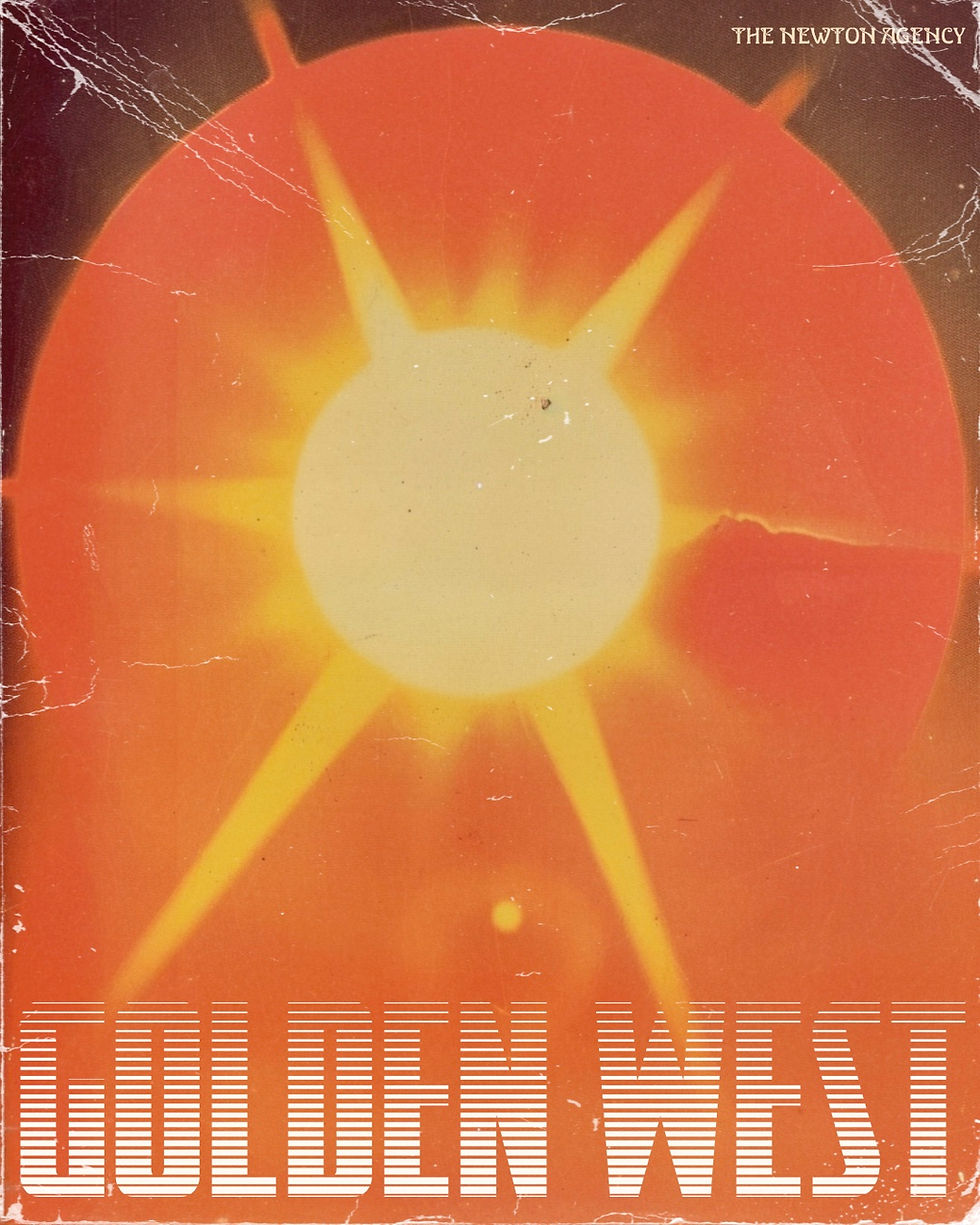
Understanding the power of a cohesive digital presence, The Newton Agency provided Parallel Editions with a comprehensive package of logo graphics. These were meticulously tailored for use across various social media platforms and the company's website. The aim was to bolster their vintage editorial charm while ensuring the brand’s visibility soared above that of its competitors.
Parallel Editions Logo Design Parallel Editions Logo Design Parallel Editions Logo Design Parallel Editions Logo Design Parallel Editions Logo Design Parallel Editions Logo Design
The Outcome: A Resonant Brand Identity
The rebranding initiative was more than just a facelift—it was a strategic move to position Parallel Editions as a beacon of high-end visual arts publishing. The new brand identity, mirroring the elegance of the bygone eras and the sharpness of modern design, was received with acclaim. It carved a distinct niche for Parallel Editions in a competitive market, proving that with the right creative partner, a brand's essence can be both honored and elevated for the digital age.
Looking Forward
Parallel Editions' story is a testament to the power of thoughtful branding. The Newton Agency's dedicated rebranding package not only refreshed a visual identity but also reignited a passion for the timeless art of book publishing, ensuring that every social media impression and website visit is an experience—a journey through a curated gallery of art and history.
For brands looking to write their own renaissance story, the message is clear: in the hands of skilled artisans of design, your brand's legacy can be beautifully woven into its future tapestry.
Make sure to visit Parallel Editions for amazing one of a kind visual art books and subscribe to their email for discounts.


Comments