
Retro Logo Design for Founder Brands: How to Do Nostalgia Right
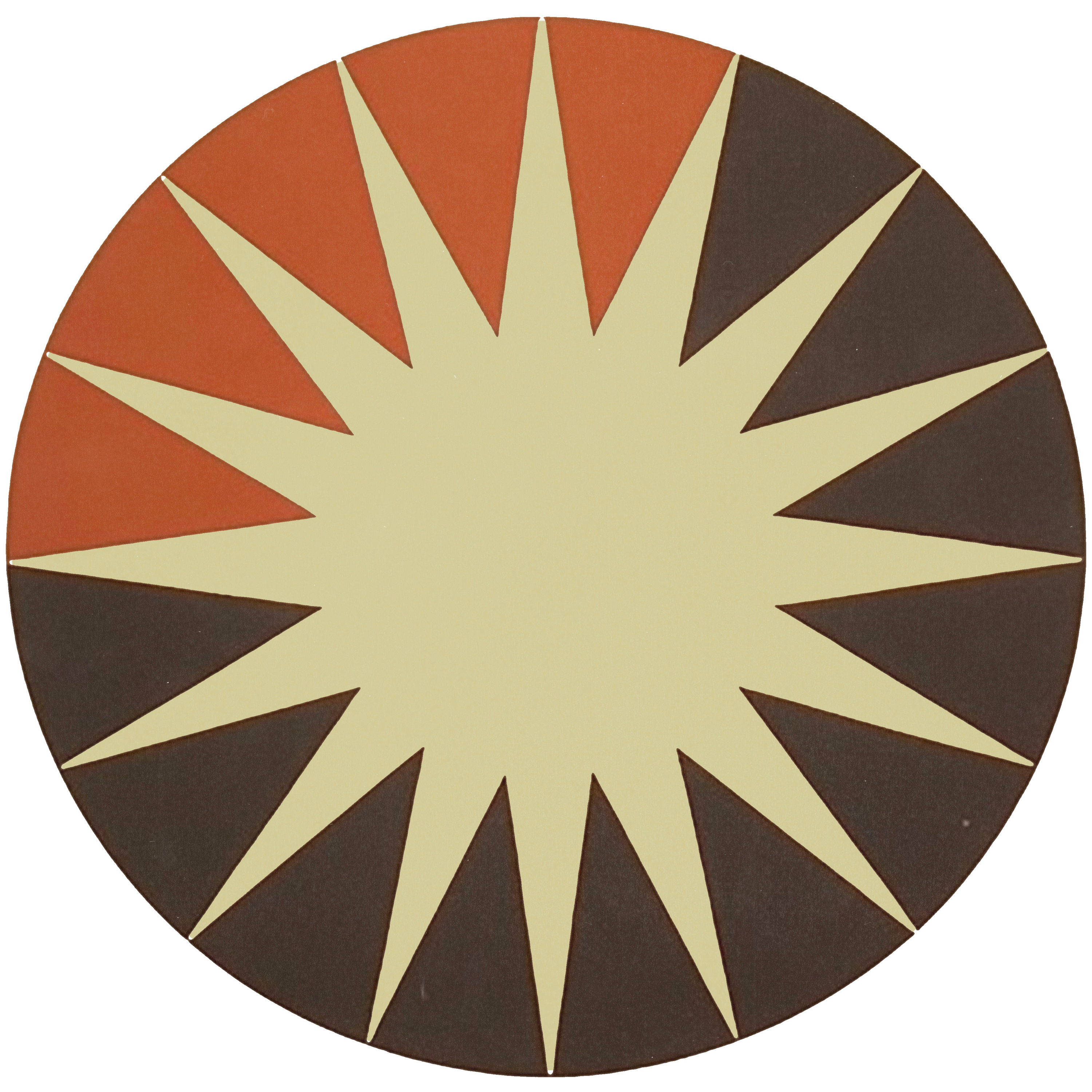
Nostalgia is the strongest lever in branding because it makes someone feel something before they can explain why. Retro logo design works on that lever. It borrows a language people already know and speaks it in a voice they have not heard yet.

Most founders think retro means copying the seventies. It does not. Retro logo design means taking the proportions, the palette, the line weight, and the feeling of a specific era, then building something new inside that language. Done right, it makes a young brand feel like it has been here a while. It says: we know where we came from, we know what good looks like, and we are not chasing whatever happened this week.
Why Retro Logo Design Works So Well for Founder Brands
A retro mark is the opposite of generic. Generic looks like everyone else in the category. Retro looks like a decision. It has a point of view before a single word gets read.
Most founder-led brands are small and cannot out-shout anyone, so they have to out-taste them. Retro logo design is a taste move. It signals curation instead of guessing, and people buy from brands that clearly have taste. Choosing a specific era is a way of saying you know what you like and you are not going to compromise it for a trend.
How to Do Retro Logo Design Without Looking Dated
Here is where it goes wrong. A founder sees a vintage aesthetic they love and copies it. The result looks like a museum piece. It reads as made in 1974 rather than informed by 1974.
Real retro work is a remix. Take the feeling of the era. Use its proportions, palette, weight, and letterforms. Then apply all of it to something contemporary. The subject is now. The execution is now. Only the feeling is borrowed.
A coffee brand can pull the palette and hand-drawn quality of seventies packaging and still land squarely inside specialty coffee culture today. It feels retro. It does not feel like it was dug out of a basement.
Choosing the Right Era for Your Retro Logo Design
Not every era fits every brand. The era has to match the story, or the whole thing reads as costume.
Americana from the fifties and sixties suits brands with heritage, local history, and a founding story. Diners, workwear, automotive, anything built to last. The feeling is trustworthy and durable.
Mid-century modern suits design-forward brands, studios, and creative businesses. Clean lines, deliberate color, considered type. The feeling is sophisticated and curated.
Psychedelic work from the late sixties and seventies suits music, art, surf, and anything genuinely countercultural. The feeling is bold and unapologetic, and it only works if the brand actually is.
Desert modernism suits outdoor brands, hospitality, and anything with a strong sense of place. The feeling is grounded and connected to landscape.
What the Good Ones Do Differently
They anchor the era in a reason. Not I like the seventies, but we are arguing for analog quality in a digital category, or we are bringing a California desert sensibility to a craft that lost it. The era is an argument, not a mood board.
They run the aesthetic through everything. The site, the packaging, the feed, the email. Retro logo design is not an island. It is the visual language for the whole brand, or it is decoration.
They modernize enough to survive. The palette can come from 1972 while the typography, spacing, and color application are current. The mark has to work at sixteen pixels and on a building.
They never explain it. If a founder has to caption the logo to tell you it is retro, it failed. The feeling should arrive before the explanation does.
The Failure Mode Is Costume
Retro tips into parody when the aesthetic has no relationship to the brand story. You cannot bolt nostalgia onto a company with no reason for it.
It also fails when the execution is too literal. Copy too faithfully and the mark stops being a brand and starts being a reproduction.
And it fails when the brand refuses to commit. A retro mark sitting on top of default minimalism everywhere else reads as indecision, and customers feel it even if they cannot name it.
When Retro Logo Design Is the Right Call
It is right when the brand story genuinely connects to an era, when you are willing to let the whole visual system agree with the mark, and when your audience finds meaning in that era rather than confusion.
It is right when you are doing it for positioning instead of for the trend. Trend-driven retro looks embarrassing the moment the trend turns. Story-driven retro just keeps working.
A founder brand with a real retro mark stands out because it stops asking to be liked. It says we know where we came from and we know what good looks like. That is the difference between taste and trend, and the logo is the proof.
If your brand has that story and no visual system carrying it yet, DESIGNFLOW is the creative department that builds one, made by artists rather than assembled from templates.


Comments