
How to Build a Vintage Brand Identity Without Looking Dated
A vintage brand identity is not about time travel. It's about borrowing from the past the things that still work, dropping the rest, and building something that feels like it could only exist now.
The difference matters more than you think. A vintage brand that works never feels like it's apologizing for when it was made. A furniture maker in Scottsdale who builds mid-century-inspired pieces does not style the website like it is 1967. The photography is sharp and modern. The copy is clear and direct. The wood is real, photographed in good light, because that is how wood looks when somebody with taste cares for it. The vintage shows up in the line weights, the color palette, the serif choice, the spacing. In restraint. In what got left out.
A brand that looks dated does the opposite. It commits to the era. Wood grain textures, faux-weathered finishes, quotes in old typography, a color story that only lived in one decade. It signals "this is our thing" the way a costume signals "this is pretend." The founder usually does not mean to. They loved something from the past and they built the whole identity around loving it, instead of building an identity that borrows from it.
Here is how to actually do it.
Lock your color story in the right decade, then update the saturation
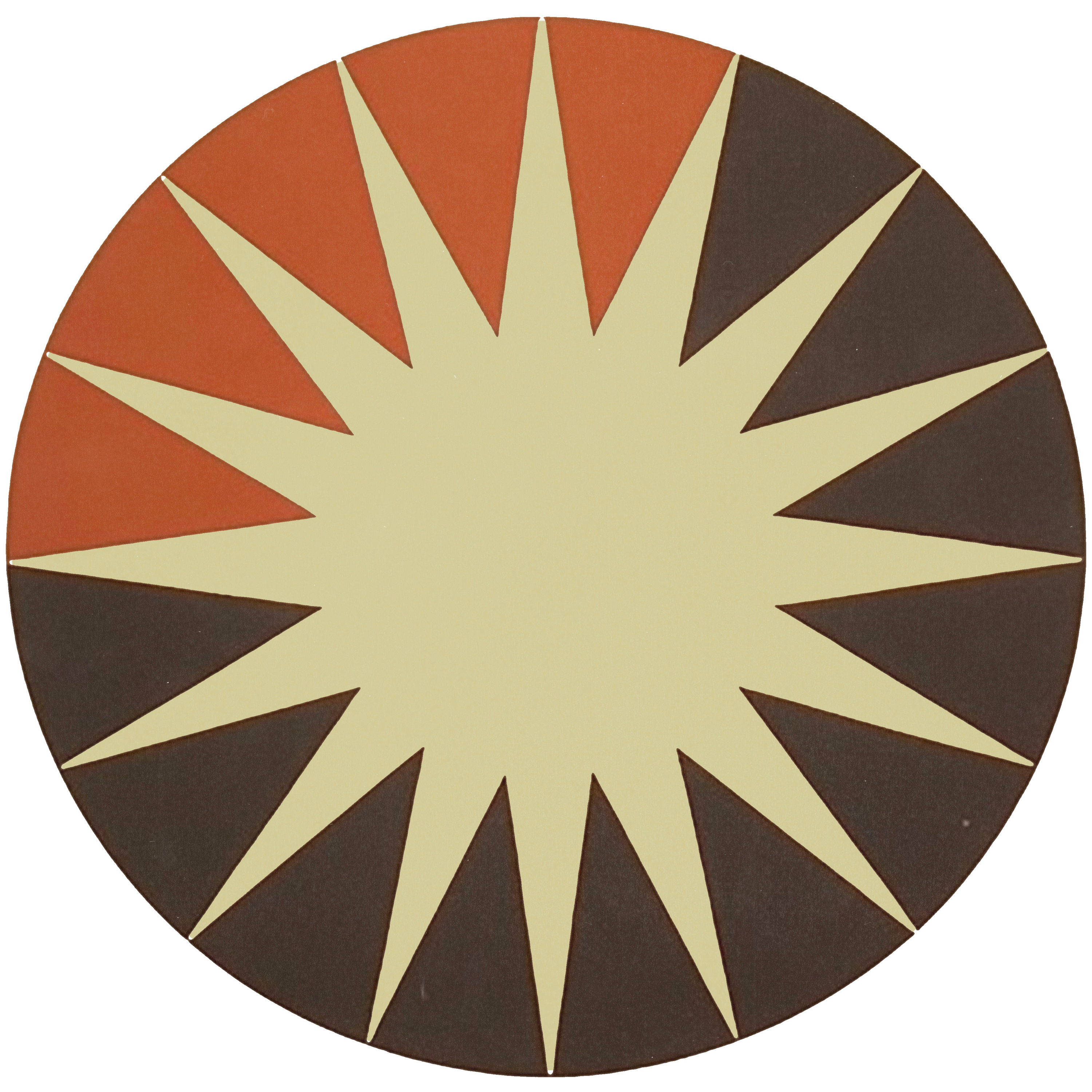
Mid-century and 1970s color palettes are strong because they were considered and bold. Burnt orange, forest green, warm gold, muted red. They work. They feel expensive. The trap is using them exactly as they lived in 1972.
If you pull a 1970s color palette straight into your brand, the eye reads it as historical. That is the point. Instead, shift the saturation. Drop the intensity. A 1970s burnt orange was loud because it stood out on wood paneling under tungsten light. Now it lives on a screen, next to thousands of other brands screaming for attention. Lower the intensity by 15 to 25 percent. Keep the warmth. Kill the shout.
The same goes for metallics and neutrals. Real vintage palettes used true gold, not the yellow-gold that dominated the 1980s. Real cream, not white. Real grays, not the cool sterile grays that feel corporate now. When you bring them forward, the saturation shift is invisible to most people. The result is just that the brand feels more sophisticated, more thoughtful, less like a museum piece.
Choose your typography with intention. One serif, one sans. Period.
A vintage brand that works uses restraint. A serif that echoes the era it borrowed from, one sans serif that is modern and clean, and nothing else. Not three serifs, not geometric alternates, not display faces in headlines.
The serif carries the history. It should be strong enough to announce itself, but not so ornate it feels costumey. A serif like Kilimanjaro has weight and presence without being decorative. It reads as "we know where this comes from" without being theatrical.
The sans serif should be contemporary and neutral. Catamaran, Avant Garde, anything that is clean and professional. The job of the sans serif is to make the information clear and the brand easy to live with. When the sans serif is also period, the whole thing collapses into theme park.
The rule is iron: one serif, one sans, everything else is silence.
Apply the palette to contemporary work, not period imagery
This is where the line between vintage and dated gets sharp. Your photography, your layouts, your product shots, your lifestyle images, all of it should be contemporary. Sharp, clean, shot with modern light and modern equipment. The vintage shows up in what you photograph and how you frame it, not in when the photo was taken.
A DTC coffee brand that borrowed 1970s design did not then fill their website with photos of old coffee shops, aged paper, and dusty shelves. They photographed real coffee in real light, in contemporary Scottsdale lofts with concrete floors and high ceilings. The vintage showed up in the color of the coffee bag, the warmth of the typography, the specific warmth of their off-white. The contemporaneous showed up in everything else.
The test: if you stripped out the text and showed the photography alone to someone aged 25, would they think it was made now? If the answer is no, the imagery is too period. Start over.
A vintage brand identity needs restraint built into the system from the start
A vintage brand identity works because it lives inside clear rules, not because it breaks them. The founder who decided to use one serif, one sans, one tight color palette, specific spacing rules, and contemporary imagery built something that stays consistent because the rules are obvious.

A brand that drifts into dated usually started with good bones and then accumulated decisions. One serif becomes two. The photographer changes and suddenly there are trendy filters. The color gets a "pop" accent that reads as 2016. Vintage turns to confused.
Document your rules. Your two fonts, your exact hex codes, your photography style, your ratio of white space to content. Write it down. Live by it. When the urge hits to add something, ask whether it serves the original idea or whether it is just new.
The strongest vintage brands are the ones where every decision ladders back to a single point of view. The founder knows what decade inspired them, what from that decade still works, and what has to stay contemporary so the whole thing does not calcify.
The real work is knowing what to drop
Most founders approach vintage branding backward. They collect things they love, a color, a typeface, a texture, a reference, and then they build an identity that includes all of them. That is how you get costumes.
The real work is harder. It is looking at what you love from the past and asking: what is the principle here, not the detail? The 1970s Americana aesthetic is not about harvest gold refrigerators and wood paneling. It is about warmth, craft, human scale, and a refusal to apologize for making something by hand. That principle still stands.
When you extract the principle, you can build a brand that borrows from the era without being trapped in it. The founder can use contemporary photography, modern layout rules, clear sans serif for navigation, and still feel authentically rooted in the thing they loved about that time.
A vintage brand identity that works is not nostalgia. It is a point of view about what lasts, applied with taste to how you build now.
If that is the brand you are trying to build, book a DESIGNFLOW discovery call. This is the exact work we do every day.


Comments