
The Ends: A Restaurant Brand Identity Built From Nothing
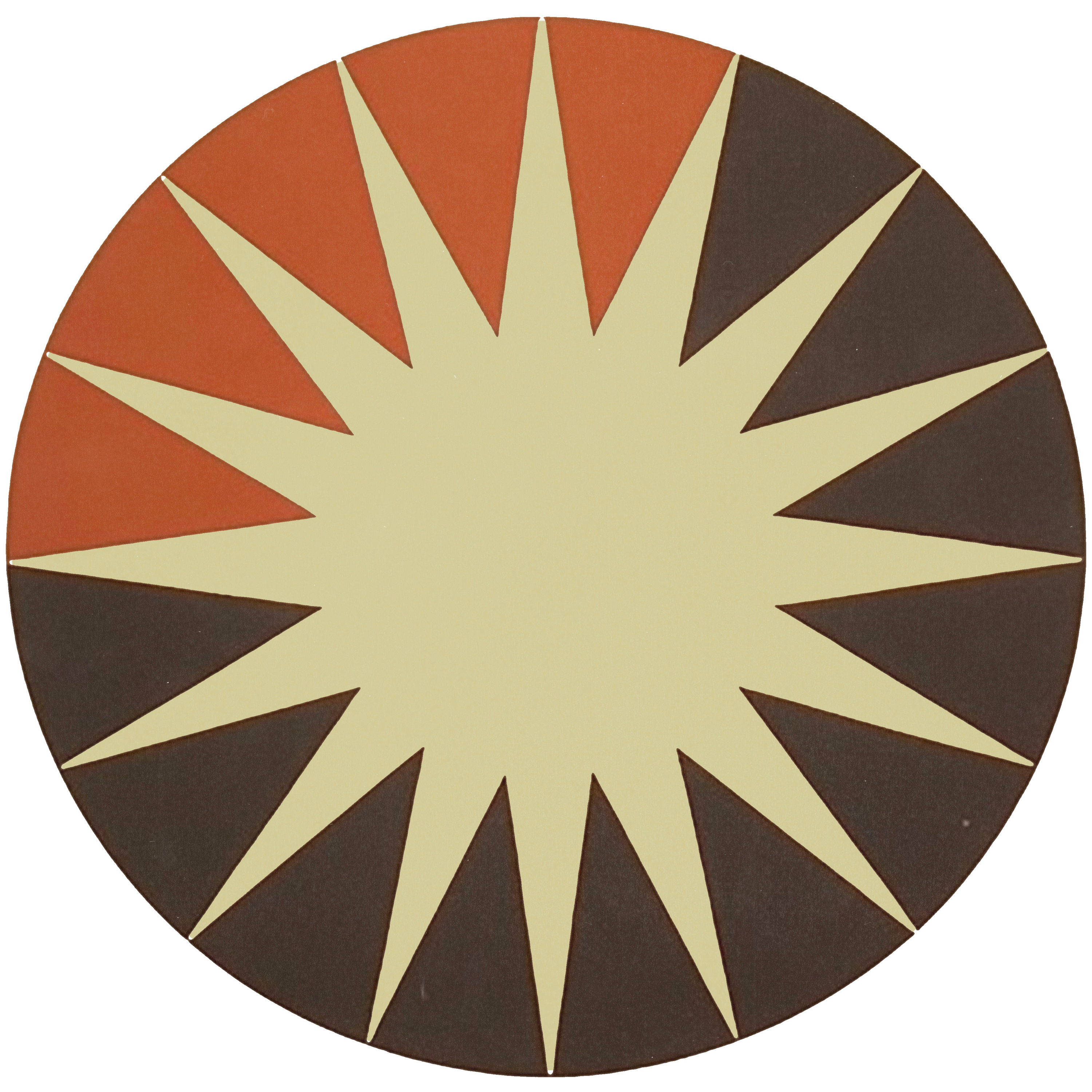

Tommy Plato had a restaurant concept most people would have flattened into a theme. A tribute to Anthony Bourdain, set in the old Kazimierz wine bar space in Old Town Scottsdale, serving honest food cooked in tallow with flavor pulled from everywhere Bourdain had been. What he did not have was a restaurant brand identity, and in this business that is the difference between a good room and a room people talk about. The Newton Agency built it from the ground up. Strategy first, then the mark, then the menus, the website, the logo reveal film, and the small printed things a guest holds without thinking about them. The Ends opened in June 2024. Within a year it had a Foodist Award and Phoenix New Times had named it the Best Restaurant in Phoenix. The whole project lives in our portfolio.
Where The Ends started
A restaurant is the hardest thing to brand, because the brand is not sitting on a shelf where you can control it. It is a room, and the room answers back. A guest decides what they think of you somewhere between the sidewalk and the host stand, long before a plate leaves the pass.
Tommy took over a space carrying twenty years of memory. Kazimierz was an Old Town institution, and whatever opened in its place was going to be measured against it by everyone who ever spent an evening down there. The concept carried its own risk on top of that. Bourdain is beloved enough that a clumsy tribute reads as costume. Photos on the wall, a quote set in a script font, the kind of homage that makes people wince into their menus.
So the starting point was a strong idea with real conviction behind it and nothing visual to carry it. No mark. No type system. No menus, no site, no way for the concept to introduce itself before the food arrived. That is the gap that closes restaurants. The kitchen is good and the brand says nothing, so the room fills on Friday and sits half empty on Tuesday.
What goes into a restaurant brand identity that holds a room?
Everything a guest touches, and a decision behind each one. The mark, and how it behaves at the size of a matchbook and the size of a wall. Type that can carry a menu which changes and still read as the same restaurant. A palette that survives dim light. Menus, because the menu is the one piece of design every guest holds in their hands and reads word for word. Signage, merchandise, the website people check before they book, and motion for the places a still image cannot go.

The cheap version of this is a logo and a color. It falls apart at the second touchpoint, usually the menu, because nobody decided how the type behaves when the kitchen rewrites the dish list on a Tuesday afternoon. Someone opens a template, makes a reasonable guess, and the restaurant quietly becomes two brands.
None of it gets decided by taste alone. It gets decided by what the restaurant is actually saying, which is why the work started somewhere else entirely.
The work started with the concept, not the mark
Before anyone drew anything, we asked what Bourdain actually meant to Tommy. The answer had nothing to do with food. It was a posture: curiosity without snobbery, appetite over expertise, a man who would rather eat at a plastic stool on a side street than at the best table in the city. That posture became the spine of the brand, and it settled arguments before they started. Anything that felt exclusive was wrong. Anything that felt precious was wrong. The place had to feel like it had been there a while and had nothing to prove.
The room helped. White brick, green plants, mid-century lines, graphic southwestern art. The identity had to live inside that room without competing with it, so the visual language went warm and plainspoken, drawing on mid-century American signage and the kind of lettering you find on a place that has been open since before anyone thought about branding. The nostalgia sits in the shapes. Nothing announces it.
Then it went out across everything. Menus, print, apparel, the site, and a logo reveal film so the mark had a way to move. One system, built once, used everywhere, which is what keeps a young restaurant from looking like three different restaurants across its first year.
Where the work landed
The Ends opened in June 2024 and the city noticed fast. A Foodist Award came first. Then Phoenix New Times named it the Best Restaurant in Phoenix, which is not something that happens to a room in its first eighteen months unless a lot of decisions were right.
The food earned that. Awards go to kitchens, never to logos. What the brand did was make sure nobody had to be talked into walking in. It set the expectation on the sidewalk, held it on the menu, and matched what arrived on the plate. When those three agree, a guest relaxes, and a relaxed guest comes back. When they disagree, the guest feels it without being able to name it, and they do not come back.
The identity, the menus, and the film are all on the project page for The Ends.
What a founder can take from this
A restaurant brand identity does not get built by choosing a logo and hoping the rest falls in line. It gets built by deciding what the place stands for, then letting that decision make every visual choice that follows. Most founders skip that step because it feels slower. It is the step that makes everything after it fast.
If you are opening something and the concept is further along than the brand, close that gap before the doors do. DESIGNFLOW is the creative department that closes it. Three thousand a month standard, five thousand a month premium with website builds, five brands at a time so nothing gets rushed. Bring the idea. We will build the world it lives in.


Comments