
What Is a Brandmark? Why the Symbol Alone Doesn't Build a Brand
- Mar 12
- 4 min read
Updated: 3 days ago
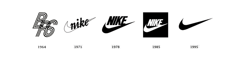
A brandmark is the symbol that stands for a brand without spelling out its name. The Nike swoosh. The Apple apple. The Target bullseye. One shape, no words, carrying the entire company on its back. Founders fall in love with brandmarks early, and for good reason: when one works, it becomes the fastest recognition signal a brand owns. But a brandmark does not build a brand. It introduces one. The strategy underneath the symbol and the system that surrounds it after launch do the actual building, and most founders skip both.
What does a brandmark actually mean?
In identity design, a brandmark is a symbolic graphic that represents the brand independently of its full logo. A logo can include the name, the typography, the symbol, or all of it locked together. The brandmark is the symbol alone. That distinction matters because a symbol has nothing to lean on. A wordmark borrows meaning from the name. A brandmark has to earn its meaning from somewhere else, and that somewhere else is the brand behind it.
Think about what the swoosh actually does. It says movement, speed, and a specific attitude about effort, in one stroke, to people who cannot read English. Nobody taught you that with a glossary. You absorbed it through decades of campaigns, athletes, shoeboxes, and repetition. The shape is a container. The brand fills it.
That is why the brandmark is the hardest asset in an identity system to get right, and why it should never be designed first.
Why do most brandmarks fail?
Because they get designed backwards. A founder starts with the symbol before the strategy exists, and the result is familiar: a geometric icon that means nothing, an abstract shape pulled from a trend report, a clever mark with no relationship to the story it is supposed to carry. It looks fine on a business card and it says nothing, because there was nothing for it to say. The mark is the compression of the brand. If there is no brand to compress, you get decoration.
We see this every week. A founder arrives with a mark they paid good money for and no answer to the questions underneath it. Who is this for. What does it stand against. Why would a stranger pick it over the one sitting right next to it. The symbol was supposed to answer those questions by osmosis. Symbols do not work that way.
How does a real brandmark emerge?
In professional identity work the symbol comes near the end, and it comes out of the material, never out of thin air. Strategy first: positioning, audience, narrative, the plan for what the brand is actually saying. Then the identity system starts to form. Typography, color, art direction, the visual language the brand will live in. Only then does symbol exploration begin, because only then does the mark have something to anchor to. It might reference the product, the origin story, the founder's philosophy, or the emotional tone the strategy defined. When the groundwork is real, the mark almost reveals itself. A good brandmark is simple. A great one feels inevitable.
You can see the difference in the work. When we refreshed Duvin Design Co., a Miami leisurewear brand with a cult following, the marks were the easy part. The years of meaning the brand had already earned did the heavy lifting. Our job was building the system strong enough to hold that meaning across two collections and every seasonal drop. The same logic runs through the VISSLA collaboration: the art carried the meaning, so the identity around it had one job, stay out of the way and keep it consistent.

What happens after the brandmark?
This is the part founders need most. Recognition comes from repetition. The mark accumulates meaning every time it shows up attached to something consistent: a campaign, a product drop, a website, a post, a package on a shelf. Each touchpoint pours a little more meaning into the container. Starve it of that repetition and the brandmark stays a shape floating without a story.
This is also where young brands drift. The freelancer who drew the mark moves on. Another designer builds the site. A third handles social. Each one interprets the identity a little differently, and within a year the symbol is the only consistent thing left, surrounded by assets that no longer agree with each other. Consistency is what makes a brandmark powerful, and consistency is exactly what the one-off project model cannot deliver.
The brandmark is the seed. The system around it is what grows. DESIGNFLOW exists for this reason: one team living inside your brand month after month, producing the campaigns, packaging, web, and content that keep the mark saying the same true thing everywhere it appears.
The symbol is the start, and the start is the smallest part
If your brandmark is carrying less weight than it should, the fix is rarely a new symbol. Build the brand behind it and the system around it, and the mark starts working the way the famous ones do. That is the whole trade. A symbol you design once. A brand you build every week.
Ready to put a system behind your symbol? See how DESIGNFLOW works.
The symbol opens the door. The system is what makes people remember.





Comments