
Parallel Editions: A Logo Redesign That Started at a Garage Sale
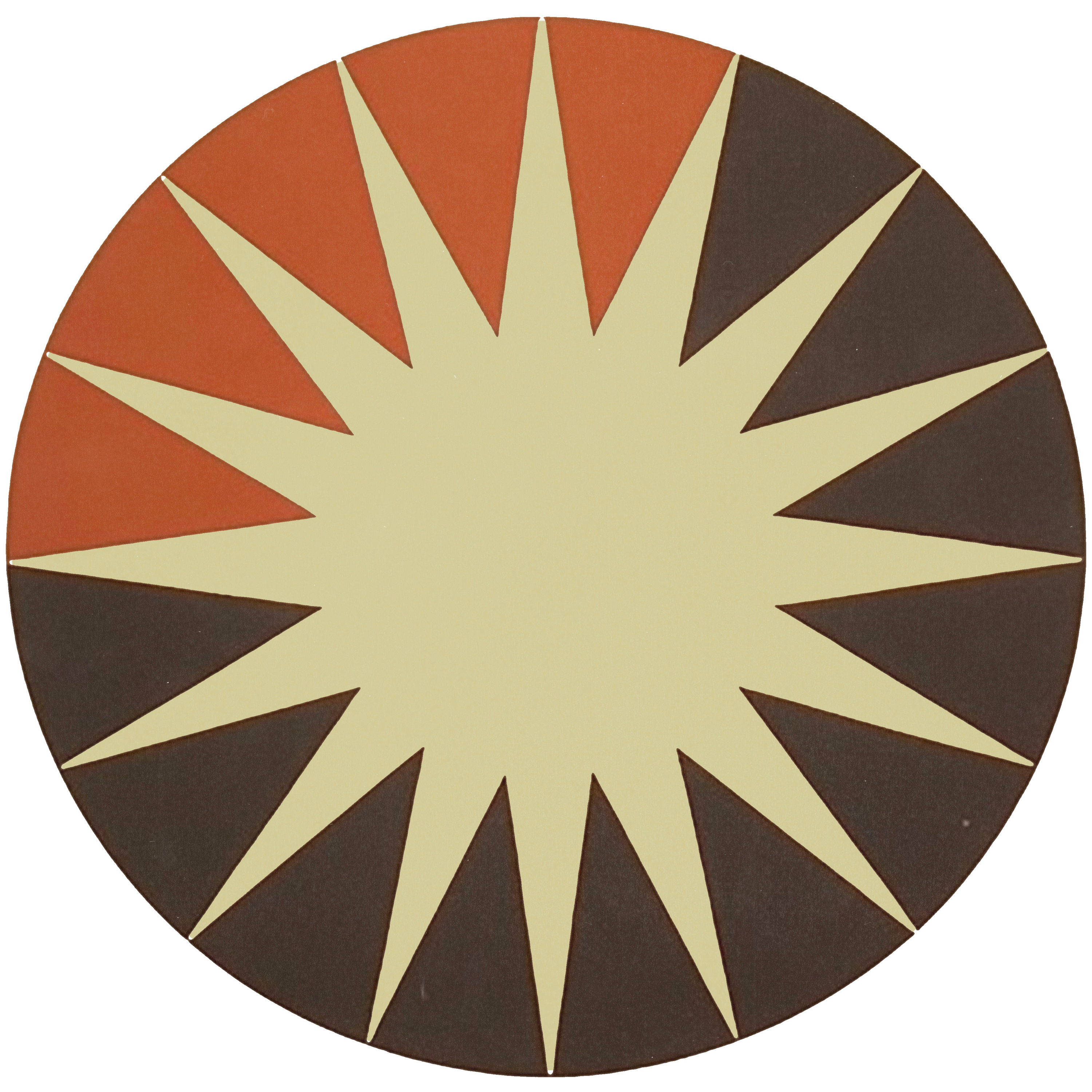
Parallel Editions is an independent publisher and bookseller in Los Angeles and Paris, specializing in high-end books on the visual arts. They came to The Newton Agency with a business already worth admiring and an identity that undersold it. The work was a logo redesign in the fullest sense: a rebuilt logo suite, a visual system redesigned around it, and the content and social graphics that carry it into the world. The whole project was built backward from one object, a vintage design book found at a garage sale in the LA hills, and you can see where it landed in our portfolio.

Where Parallel Editions started
Picture the problem. A bookseller whose entire trade is taste. Every title on the shelf is there because someone with a trained eye decided it deserved to be, and the customers are people who buy books on Josef Albers the way other people buy sneakers. When that business speaks with an identity that does not carry the same discernment, the gap is not cosmetic. It is credibility. The audience Parallel Editions serves can read a spine from across a room and price the design instincts behind it in about two seconds.
That was the starting point. Not a broken company, not a blank page. A real business with real inventory, a sharp point of view, and a visual identity that had never been built to the standard of the things it was selling. Founders in every category know this gap. The work is excellent and the wrapper mumbles. For a publisher of art books, the wrapper mumbling is close to fatal, because the wrapper is the argument.
The garage sale book that set the direction
Every identity we build needs a true center, something more specific than a mood board. For Parallel Editions it was a single moment: a vintage design book found at a garage sale in the LA hills. Worn and minimal on the outside. Extraordinary within. Thirty seconds with that object tells you everything the brand needed to say about itself, that restraint on the surface can hold riches underneath, that age is not damage, that the best things are found by people who are looking.
We built the identity around that feeling. Not around the book as an artifact, around what it felt like to open it. That distinction is the whole craft. A brand built on an artifact becomes a costume. A brand built on a feeling becomes a filter, something you can hold every future decision against and ask, does this belong.
What makes a logo redesign work?
A logo redesign fails when it starts at the sketchpad. It works when it starts with the question of what the mark has to argue for. Parallel Editions needed a logo suite that could sit on a spine next to the best-designed books of the last century and not flinch, which meant the bar was not "modern" or "clean." The bar was timeless, authentic, and bold, the qualities of the books themselves.
So the redesign kept faith with the brand's soul and rebuilt everything structural. A full logo suite rather than a single mark, because a publisher lives in dozens of contexts: spines, title pages, shipping boxes, web headers, a stamp inside a cover. A visual system with rules, so the identity behaves the same whether it is on a tote bag or a product page. Type and composition that nod to the mid-century design canon their customers already love, without imitating any of it. The result reads like it was always there, which is the highest compliment a redesign can earn.
From the logo suite to the feed
A mark alone does not run a brand, which is why the engagement did not stop at the logo suite. We built content and social media graphics on top of the new system, so the identity shows up in the feed the way it shows up on the shelf: consistent, considered, unmistakably Parallel Editions. This is the part most redesigns skip. The founder gets a beautiful new mark, posts three times, and watches the identity dissolve into whatever template was closest. A system with content built on it does not dissolve. See how the pieces hold together in the Parallel Editions project.
What founders should take from this
If your product is already excellent and your identity undersells it, you do not need a reinvention. You need a redesign with a true center, built by people who can find that center and hold it through every asset that follows. Start with the object, the moment, the feeling your brand actually comes from. Then build until everything you touch says it.
That is the work DESIGNFLOW exists for: a creative department on subscription, the same artists carrying your identity from the strategy through the logo suite and into every graphic after it, $3,000 a month, no contracts. If your brand mumbles while your work speaks, book the call and bring what you sell.
Parallel Editions sells extraordinary things in modest covers. Now it looks like it knows.


Comments